Create Chart
This tutorial walks you through creating a basic bar chart that displays the number of service calls per status.
1. Start a New Report
- Navigate to Administration → Reporting → Reports
- Select the Service Call entity
- Click to create a new report
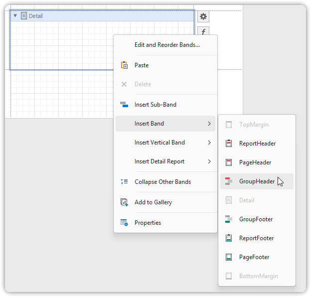
2. Add a Group Header Band
- In the Report Designer, insert a GroupHeader Band
- This will host the chart control
3. Add a Chart Control
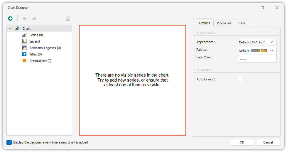
- From the Toolbox, drag the Chart control into the newly created band
- Upon dropping the chart, a Chart Wizard dialog will appear
4. Configure the Chart
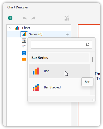
Create a Series
- In the Series Collection panel (left side), click the plus (+) button to add a new series
- Set the chart type to Bar
Set Chart Data
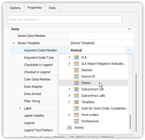
- Go to the Properties tab (right side)
- Scroll to the Data section
Set the following:
- Series Member –> Argument Data Member =
Status
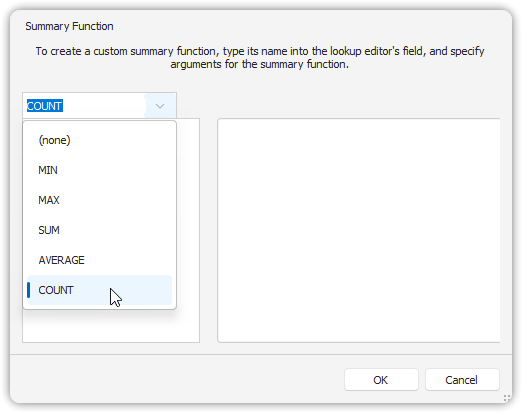
- Series Member –> Qualitative Summary Options –> Summary Function = Click the ellipsis (
...) and selectCOUNT()
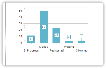
5. Preview the Chart
- Click on the Print Preview tab to see the rendered chart
- You should now see a bar chart counting service calls grouped by status
6. Modify the Chart Further
To open the Chart Designer again:
- Select the chart control on the design surface
- Click the small icon (⚙️) that appears next to it
- In the context menu, select Run Designer…
This allows you to fine-tune chart settings such as appearance, labels, axis formatting, colors, and more.